

November 15, 2021
Red Dot Award
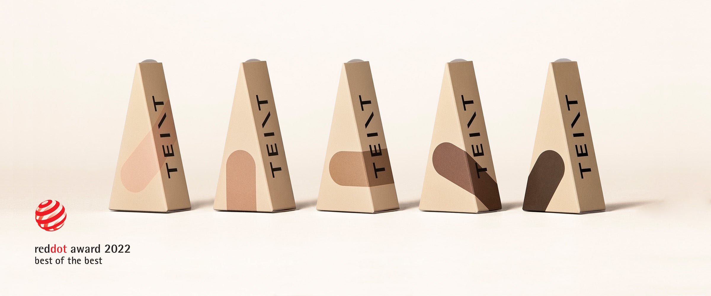
Teint Winner of The Red Dot Design Award - Best of the Best
Every now and then, a solution emerges that makes one wonder why no one has thought of it before – and that is also the case with these plasters. With the idea of making plasters available in different skin tones, the design of Teint realises a subtle approach to enhancing this type of product. While traditional plasters are only available in one specific colour, Teint offers a choice of several shades. With the possibility of individual customisability, the Teint concept also aims to advocate the implementation of contemporary values in design. Thus, the realised idea stands for the maxim of designing products that do justice to the diversity in culture and society and internalises the differences between people as a fundamental commitment. As part of the design concept, the plaster packaging was also revised and fundamentally reinterpreted. With its friendly triangular shape, it breaks with the all too common impression of a pure medical product packaging look. Instead, it features a noble appearance with a graphic design that clearly visualises the respective skin tone. This packaging also offers functional advantages, because unlike conventional plaster boxes, which are often not very intuitive to handle and allow plasters to fall out, it allows individual strips to be removed with one hand. The packaging thus features a triangular shape that not only makes it easy to find when stowed in a bag, it also allows for refilling to minimise paper consumption.